Spotify Unblocked: Why Spotify Gets Blocked And What You Can Do About It?
Jun 22, 2026

Little things matter, and God is in the details. On our crowded planet, we are surrounded by a cacophony of life.
But yet our ears strain for the distinct, perfect melody. We always watch out for the song of a:
Why? Because those tiny creatures stretch beyond the ordinary. They execute a specific, spectacular performance to attract a mate or protect their young.
For your business, that means your message can’t just chirp generically. It has to sing a specific, spectacular tune.
This is what makes customers stop scrolling and actually listen.
That meticulous, show-stopping detail, a perfect headline, a hilarious button, isn’t just polish.
Landing page optimization is what turns casual browsers into loyal fans and sends your sales soaring. And this meticulous attention to detail is precisely what drives superior sales conversion rates.
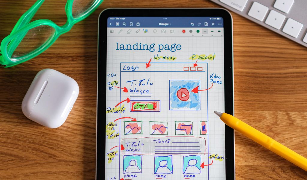
Imagine a dynamic young man, let’s call him our entrepreneur. He had a working model that was an engineering marvel, a business blueprint so robust it could withstand a hurricane.
His investor presentation was flawless, and his financial projections were a symphony of future wealth.
Yet, when he finished his pitch, the room was silent. The investors, with the predatory calm of market veterans, simply shifted in their seats.
The funding round evaporated like dew in the morning sun.
Where did he fail? His product was a diamond, but the box he presented it in was a drab cardboard container.
The pitch itself was a dazzling spectacle, but the investors, being pragmatic, immediately checked the proof of concept—the online doorway, the landing page.
They found a jumbled mess. The headline sounded like a legal document.
Additionally, they found a call-to-action button that was the color of dust, and a form that demanded a prospective buyer’s life history.
He had built a Rolls-Royce but ushered customers through a rickety turnstile. The investors didn’t see the hurricane-proof model. They saw a leaky faucet.
His magnificent business was sunk not by a faulty engine but by a single, poorly designed digital doorknob.
The difference between a bustling success and a digital ghost town often hangs on a thread of meticulous detail.
Your magnificent marketing campaign, the creative equivalent of an Olympic relay runner, must end with a perfect baton pass—the landing page.
If that final connection fumbles, all the preceding effort is wasted. Landing Page Optimization (LPO) is not optional; it is the silent engine of your revenue stream.
Here are eight critical points on how LPO transforms casual clicks into committed conversions:
Have you ever walked into a store where the cashier is also selling lottery tickets, fixing watches, and giving legal advice?
You’d bolt. A highly optimized landing page serves one master and one goal—be it a purchase, a sign-up, or a download.
We ruthlessly eliminate the digital noise. Firstly, it can be the secondary navigation bars.
Additionally, we will have links to “About Us,” or any rabbit hole that leads the user away from the Call-to-Action (CTA).
LPO mandates that the page functions like a velvet rope, allowing users in but gently guiding them straight to the VIP section (the conversion goal).
This singular focus slashes abandonment rates and elevates conversion performance.
The biggest betrayal in the digital world is the headline mismatch. A user clicks an ad promising “40% Off Premium Widgets,” but the landing page screams “Welcome to Our Corporate History.”
This cognitive dissonance is a guaranteed conversion killer. Effective LPO ensures message matches are seamless.
The landing page headline must echo the language, offer, and tone of the initial ad.
Additionally, it should create a feeling of continuity and trust. It needs to be like a handshake:
When the landing page validates the user’s decision to click, the pathway to purchase is instantaneously smoothed.
Nobody enjoys a twenty-question interrogation, especially when they are trying to spend money.
Conversion forms are the necessary evil of lead generation, but LPO dictates they must be lean, mean, and utterly efficient.
We apply the Principle of Minimal Necessary Information. Do you really need their spouse’s name and favorite flavor of artisanal toast for a free e-book download?
Every unnecessary field introduces friction and causes drop-offs. Optimizing a form means shrinking it, using multi-step progression (if necessary), and ensuring input fields are simple and clear—turning a daunting digital roadblock into a gentle speed bump.
Let’s be real, online attention spans are shorter than a goldfish’s. A smart landing page uses visual breadcrumbs to guide that frantic scan.
Make the key benefit, a few happy customer quotes, and that all-important CTA button the undeniable stars.
Use punchy colors and breathing room so the “Buy Now” practically winks. We’re making the path to conversion a no-brainer slide, not a confusing maze.
People hate throwing money into the internet’s void. So, how do you convince them? Load up your page with trusty sidekicks!
Think security badges (the internet’s hall monitors), press logos (look, we’re famous!), and happy customer quotes.
This digital security blanket tells visitors, “We’re legit, we’re safe, and other people loved it!” Less fear = more “Add to Cart” celebrations.
Do you hold on to first impressions? Most people do. It’s hilarious, isn’t it? We spend a fortune on ads to get that perfect click, only to fumble the handoff.
It’s like finally getting a date, then showing up with spinach in your teeth.
Ignore those final details, and you’re essentially handing a customer a gold coin, then making them navigate a murky swamp just to buy a soda.
They have the intent, but your process kills the vibe. Master that last interaction, however, and you transform the swamp into a glorious, welcoming express lane.
That “small” tweak—a simpler form, a clearer button—is the secret handshake that turns window-shoppers into devoted fans.
It’s the difference between “almost” and “cha-ching!” Because a flawless finish is what truly makes that stellar first impression pay the bills.
Barsha is a seasoned digital marketing writer with a focus on SEO, content marketing, and conversion-driven copy. With 8+ years of experience in crafting high-performing content for startups, agencies, and established brands, Barsha brings strategic insight and storytelling together to drive online growth. When not writing, Barsha spends time obsessing over conspiracy theories, the latest Google algorithm changes, and content trends.
View all Posts

Spotify Unblocked: Why Spotify Gets Blocked A...
Jun 22, 2026
Colorizing Old Photos With AI: A 2026 Guide T...
Jun 20, 2026
SEO For Watch Retailers: A Practical Guide to...
Jun 19, 2026
Native Ads Vs Popunder: Which Format Works Be...
Jun 19, 2026
How Local SEO Helps Businesses Compete Agains...
Jun 19, 2026