

Google Looker Studio: What It Is, How It Works, And How To Use It For Better Reporting
Sep 30, 2026

Marketing teams rarely have a data problem. In most cases, the problem is how all the data at our disposal is scattered everywhere – like literally.
TBH, if you think about it, Google Search Console has search performance, Google Analytics has website behavior, and Google Ads has campaign data.
Also, SEO platforms have rankings and backlinks, while CRM systems have leads and sales. Frankly, each platform is relevant and offers something useful.
As someone working in digital marketing for nearly a decade, I can tell you the problem starts when you want to see the whole picture – all your data in one place. Otherwise, how are you going to use so much data for effective results?
And this is where Google Looker Studio steps in to save the day! It allows users to gather all their data from multiple sources into interactive dashboards and reports.
But it’s not about ‘making things look’ better, thanks to visually appealing charts and elements. Instead, it is more about making scattered data easier to compare, explore, and explain.
And today, I’m going to discuss Google Looker Studio in detail, breaking down what it is, how it works, and more importantly, how you can use it for better reporting.
Stay tuned.
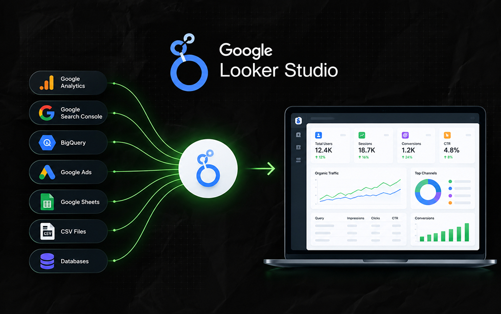
Google Looker Studio is a reporting and data visualization platform that lets you connect data sources and turn them into interactive dashboards and reports.
You can use it to visualize data from sources such as:
Then, you can build charts, tables, scorecards, filters, and other visual elements around that data.
For example, an SEO dashboard could bring together:
Instead of opening several platforms, a team can create one reporting environment.
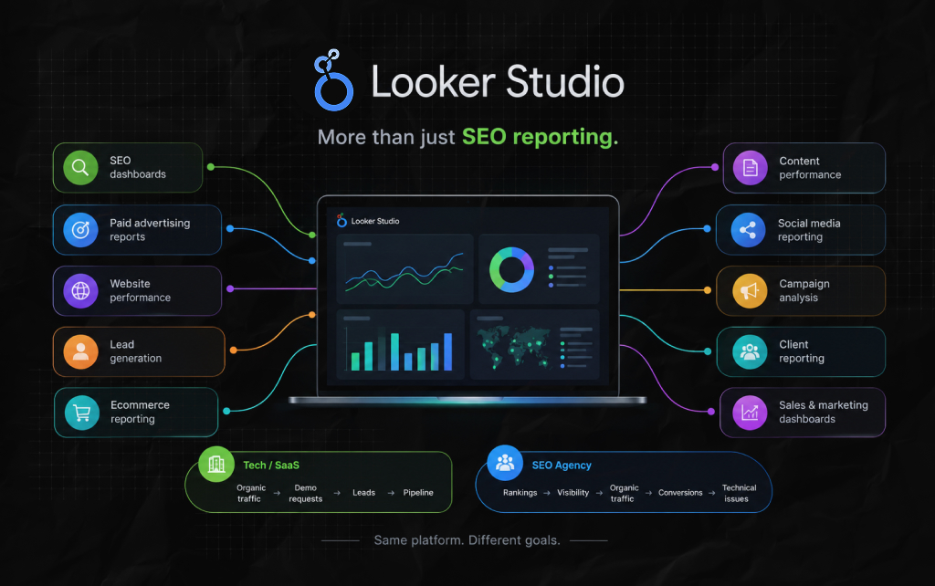
The platform is useful for much more than SEO reporting.
As someone running a 360-degree marketing team with way too much data at our disposal, it is safe to say that you can use Looker Studio for:
Frankly, it is obvious that the dashboard you need entirely depends on what questions you need to answer.
For instance, a tech business with a SaaS product will need: Organic traffic → demo requests → qualified leads → pipeline.
In contrast, an SEO agency will need: Rankings → visibility → organic traffic → conversions → technical issues.
Naturally, the platform stays the same. But the reporting logic changes.
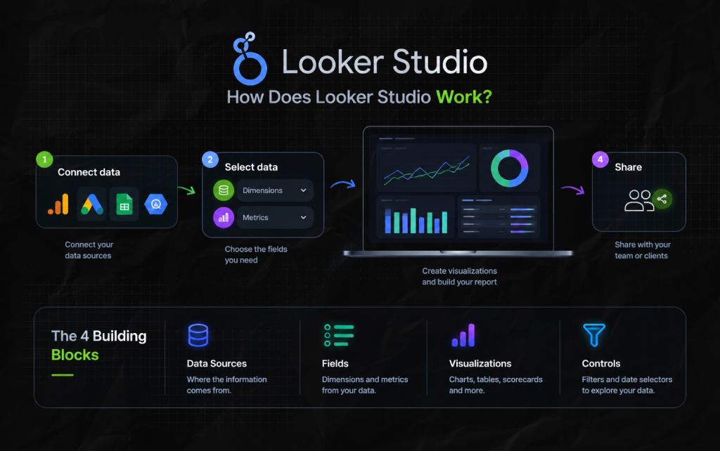
A Looker Studio report generally has four important layers:
This sounds technical, but the basic workflow is straightforward.
You connect a source. You select the data you want. Then, you create visualizations and arrange them into a report.
Once you are done, you can share the report with everyone who matters.
A data source connects Looker Studio to the underlying dataset. For instance, you can connect a Google Search Console property and a Google Analytics property.
Also, you can connect a Google Ads account, a Google Sheet, and even a BigQuery table.
In this context, you have to understand that the data source is responsible for determining what information Google Looker Studio can access.
And this distinction really becomes essential to understand when it comes to troubleshooting and related stuff.
As a result, if a chart displays any wrong number, then the issue might not be with the chart. The underlying data source or field configuration could be wrong.
So, if you are new to Looker Studio, two terms appear constantly: Dimensions and metrics.
Now, a dimension describes something. In this context, the most common examples include:
In contrast, a metric measures something, and the most common examples include:
For example, if your dimension is a landing page, then your metric is organic sessions. Then, the report can show how many organic sessions each landing page generated.
This simple distinction becomes important when building more complicated reports.
A dashboard is a visual representation of selected data. As a result, a basic SEO dashboard might contain:
But you should not automatically put every available metric on the page. A dashboard can be technically impressive and still be difficult to use.
The best dashboards answer a specific set of questions.
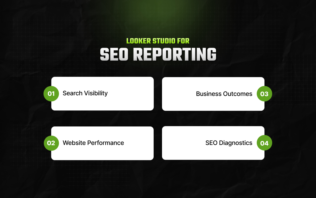
SEO is one of the most obvious use cases.
You can create a report that combines search visibility, website behavior, and business outcomes.
For example:
This creates a more complete picture than reporting only keyword rankings.
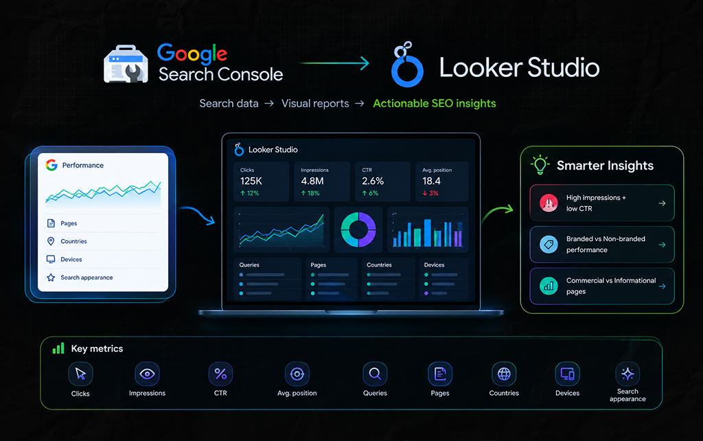
Search Console is particularly useful for SEO reporting because it contains data about how your website appears in Google Search.
So, you can use Looker Studio to visualize information such as:
For example, you could create a report showing pages with: High impressions + low CTR. That immediately gives your SEO team a group of pages worth investigating.
Also, you could compare ‘branded vs non-branded search performance,’ or ‘commercial pages vs informational pages.’
The visualization itself is not the insight. But it is the segmentation is what makes the data useful.
Google Analytics can tell you what happened after visitors arrived on your website. But Looker Studio can turn that information into a reporting interface.
As a result, you could create charts for:
The real advantage comes when you combine Analytics data with other sources.
For example, Search Console tells you people clicked from Google, while Analytics tells you what happened after they arrived.
Looking at both can help you investigate the gap between search visibility and website performance.
Agencies often use Looker Studio to create client-facing reports. This can be useful because clients may not want to navigate five different marketing platforms every month.
A report can bring selected information into one place.
For example:
The last item is worth including.
Moreover, your clients should understand not just what happened but what you changed with your SEO strategy.
And that is where you need to make a dashboard that both records actions and shows results – otherwise, your dashboard will just display a series of random fluctuations.
This is where many reporting setups go wrong. Someone builds a dashboard with 40 charts and assumes the reporting problem is solved.
It isn’t.
For instance, a chart might tell you that organic traffic fell 14%. But it does not tell you why. Moreover, you still need to investigate:
As a result, Looker Studio helps you see the evidence. But it does not replace the person interpreting it.
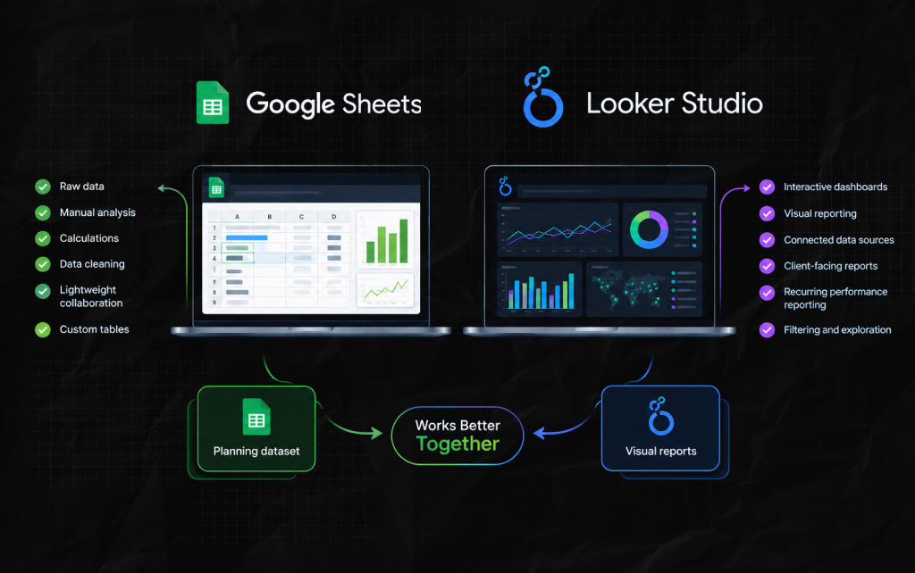
Google Sheets can also be used for reporting. So why use Looker Studio?
Sheets is excellent for:
Looker Studio is better suited to:
Also, they can work together. As a result, a team might maintain a planning dataset in Sheets and visualize selected information from it in Looker Studio.
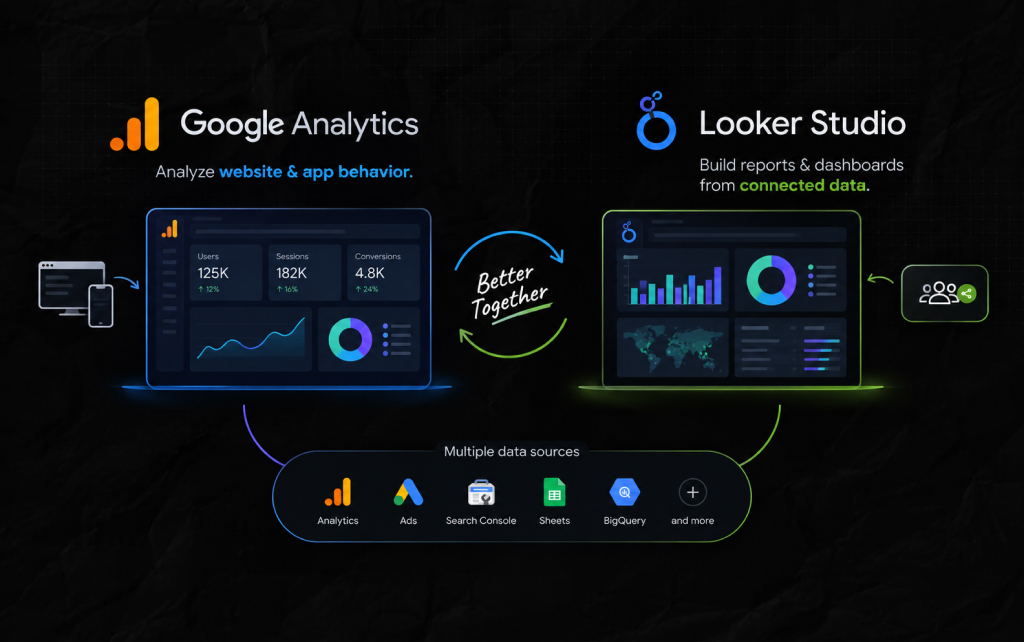
These tools are not direct alternatives.
Analytics provides the data and analysis environment. But Looker Studio provides another way to present and combine selected data.
You can use Analytics without Looker Studio. Also, you can use Looker Studio with many other data sources.
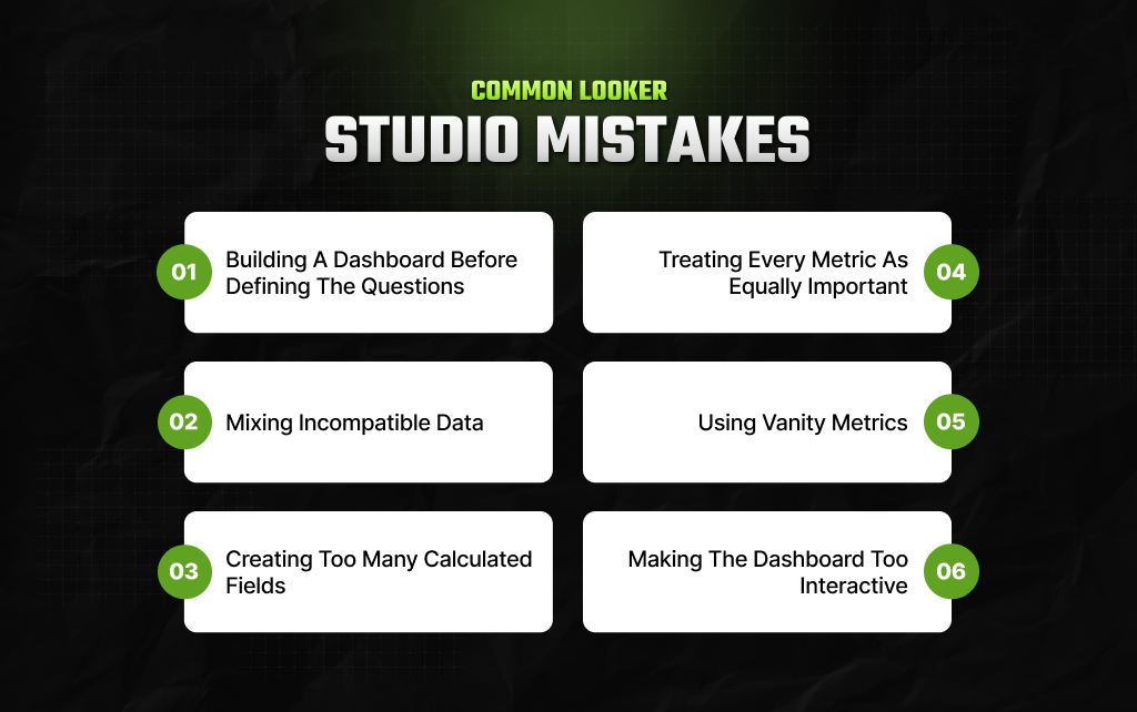
In this section, I’ve laid out the most common mistakes that people tend to make with Looker Studio.
This usually produces too many charts. So, start with what someone needs to know. Then decide which metrics answer that question.
Combining data sources without understanding their definitions can produce misleading results.
Custom calculations can be useful. Also, too many undocumented calculations make a report difficult to maintain.
A dashboard should create hierarchy. Some numbers matter more than others.
A huge number of impressions may look impressive. It does not automatically mean the business is growing.
Interactivity is useful until people spend more time clicking filters than understanding the data. Keep the main view simple.
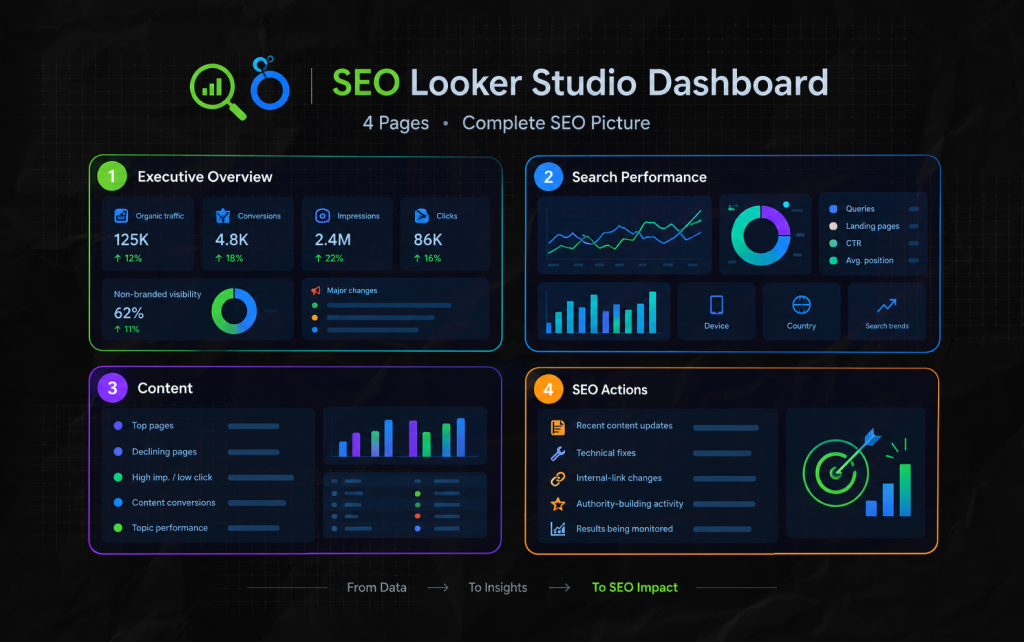
For an SEO team, a practical report could have four pages.
This structure keeps reporting connected to actual SEO work.
Good visual design matters.
But a beautiful dashboard with weak data is still a weak dashboard. As a result, the most useful report usually has:
You should be able to open the report and understand what deserves attention without studying every chart.
Google Looker Studio is most useful when you treat it as a decision-support layer, not a place to dump marketing metrics.
Moreover, it can bring Search Console, Analytics, advertising platforms, spreadsheets, databases, and other sources into a more accessible reporting environment.
But the dashboard itself is not the strategy.
For instance, a report that shows 50 metrics may tell you less than one that clearly shows:
That is where Looker Studio becomes genuinely useful.
The goal is not to build a dashboard that looks like a data center. Instead, it is to build one that helps people make better decisions from the data they already have.
Barsha is a seasoned digital marketing writer with a focus on SEO, content marketing, and conversion-driven copy. With 8+ years of experience in crafting high-performing content for startups, agencies, and established brands, Barsha brings strategic insight and storytelling together to drive online growth. When not writing, Barsha spends time obsessing over conspiracy theories, the latest Google algorithm changes, and content trends.
View all Posts

What Is Google Tag Manager? A Practical Guide...
Sep 30, 2026
SEO KPIs: Which Metrics Actually Tell You If ...
Sep 30, 2026
SEO Dashboard: What To Track, What To Ignore,...
Sep 25, 2026
Analytics SEO: How To Turn Search Data Into B...
Sep 25, 2026
AI Search Tools: What They Actually Measure A...
Sep 25, 2026