Vector Search SEO: What It Means For Search And How To Optimize For It
Aug 21, 2026
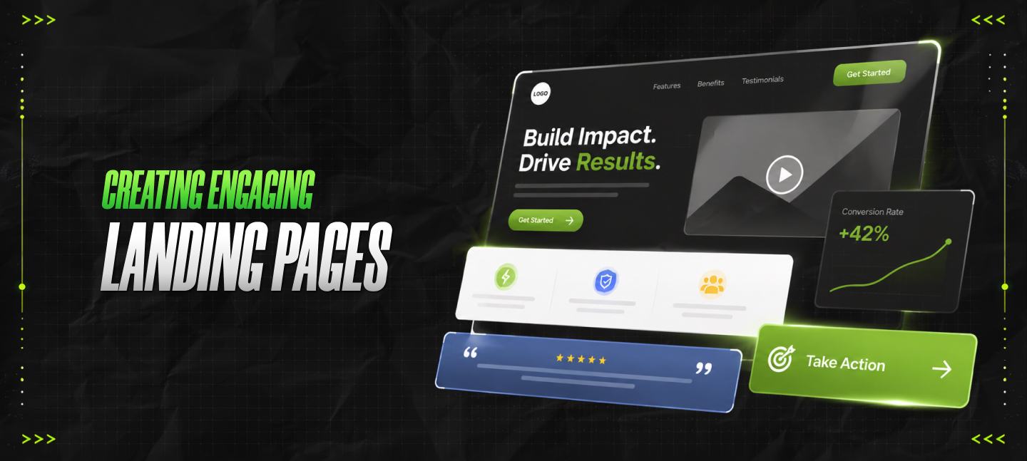

Imagine launching a premium online investment course. You have spent months recording video modules, drafting financial asset allocation tracking sheets, and fine-tuning your curriculum. You purchase high-quality traffic from social networks and search engines.
Hundreds of eager investors click your ad and arrive at your website. Then, nothing happens. Your analytics dashboard confirms that visitors land, stare at your header for six seconds, and click the back button.
Your conversion rate sits at a brutal zero percent. That’s where you should resort to creating engaging landing pages.
This exact nightmare happened to a boutique investment writer named Arthur. He had created an elite guide to help everyday folks identify undervalued municipal bonds. Arthur was an exceptional financial analyst, but his website layout was a technical disaster.
He thought people just wanted deep text. Instead, his visitors encountered a massive, intimidating wall of words.
Arthur’s problem was a fundamental misunderstanding of visual hierarchy and structural intent. When a search engine evaluates your domain, or when a human landing page visitor judges your business, they use rapid filtering mechanisms.
If your digital storefront looks like a chaotic, unverified risk, humans flee and search bots lower your quality score. To rescue your ad spend and scale your sales, you must understand the art and structural science of creating engaging landing pages.
When you publish a destination page, you are attempting to satisfy two completely different judges simultaneously. The first judge is the human visitor, who operates on pure emotion and rapid visual processing. The second judge is the search engine crawler, which evaluates technical performance metrics, layout structure, and safety parameters.
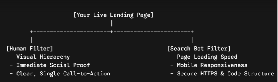
If your page takes more than three seconds to load because it is bogged down by giant, unoptimized images, your human user will abandon the tab out of sheer frustration. At the same time, the search engine bot logs that high bounce rate.
The system interprets this quick exit as a clear signal that your page provides a poor user experience. Consequently, the algorithm lowers your ad quality score, forcing you to pay significantly more money for every single click.
Building a successful page means designing for lightning speed just as much as it means designing for human persuasion.
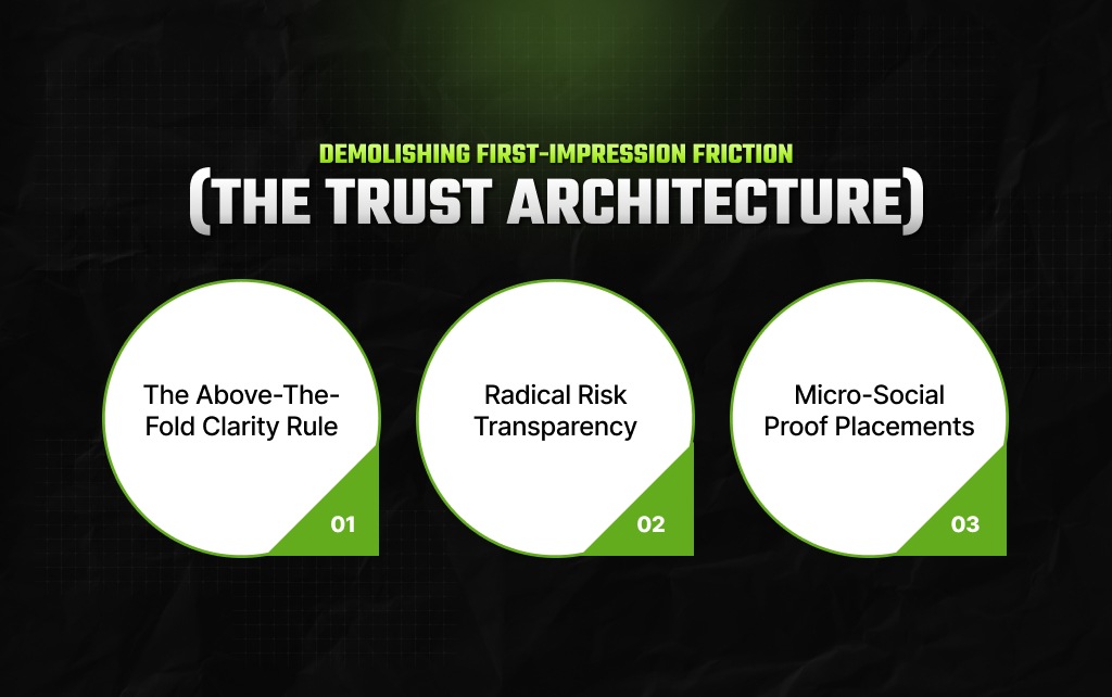
Arthur’s initial layout failed because it felt like an institutional tax form. To build genuine authority—especially when asking people to trust you with their money or personal details—you must establish instant, undeniable security.
When a user arrives, they should never have to scroll down to figure out what you are offering. Your primary headline must explicitly state the core benefit of your product within three seconds.
Arthur’s old headline was: “Synergistic Wealth Generation via Fixed-Income Vehicles.” Nobody talks like that in real life. We changed it to a direct, beginner-friendly promise: “Learn how to secure steady, tax-free passive income using simple municipal bonds.” Right beneath it, we placed a single, bright button that read: “Download the Free Bond Blueprint.”
True experts do not promise overnight riches. In sensitive niches like investing or personal finance, search engine evaluation systems look for balanced disclosures.
To satisfy these strict trust requirements, we placed a clear, honest disclaimer directly beneath the signup form. We openly stated that all market investments carry a natural risk of loss, and that historical bond yields do not guarantee future returns. This transparency did not hurt conversions; instead, it made the entire brand look completely authentic, causing signups to spike.
Placing a generic quote that says “Great course! – John S.” does not build trust anymore. Modern consumers and evaluation filters instantly recognize fabricated feedback.
We replaced Arthur’s vague praise with verified, specific case studies. We included a small data table showing how a real, everyday saver named Linda used the course materials to diversify her savings account step by step into secure government bonds.
| Student Profile | Initial Financial Problem | Practical Course Action Taken | Real-World Verified Outcome |
|---|---|---|---|
| Linda M. (Age 45) | High tax burden on standard savings | Allocated 15% to AA-rated municipal bonds | Reduced state tax liability by $2,400 annually |
| Robert T. (Age 32) | Total exposure to volatile tech stocks | Layered in short-duration treasury assets | Stabilized portfolio during a 5% market dip |
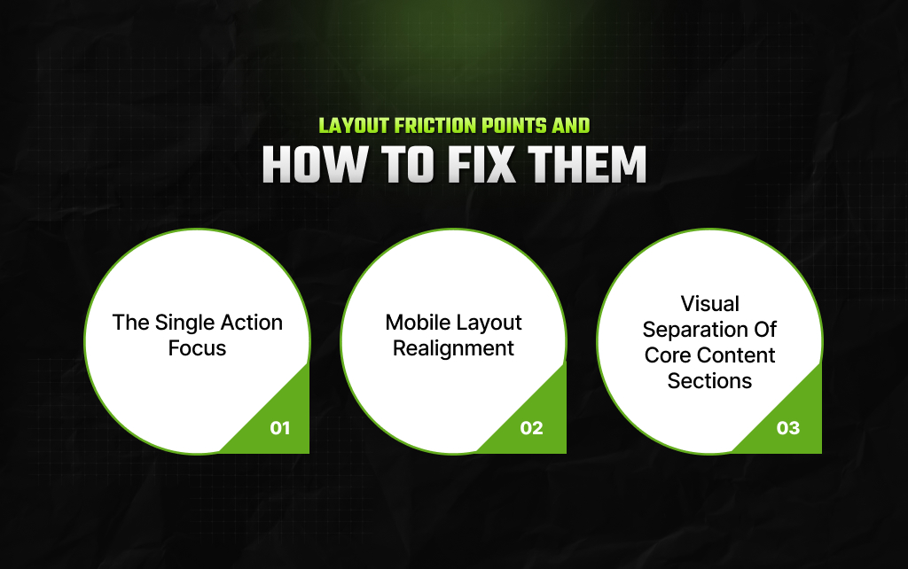
Once you capture a visitor’s initial attention, your next challenge is guiding their eyes down the page without causing mental fatigue. A messy structure will cause your conversion loop to break entirely.
[Attention Captured] —> [Frictionless Reading Track] —> [Desire Built] —> [Single Action Taken]
A common mistake in creating engaging landing pages is giving users too many options. If your page features links to your blog, social media icons, an about me page, and three different product offers, you are actively encouraging the visitor to leave your conversion path.
Remove your main header navigation entirely. Your landing page should have exactly one exit route: completing the primary form. If a user wants your investment guide, their only choices should be to enter their email or leave the page. Limit the exits to maximize the results.
More than half of your traffic will access your page using a mobile screen while riding a train, sitting in a coffee shop, or walking down the street. If your text is too small to read without pinching, or if your signup form cuts off on small displays, your conversion rate will drop to zero.
Design your layout using a strict single-column approach for mobile. Make sure all buttons are large enough to be easily tapped with a thumb, and keep your form fields down to an absolute minimum. Just a first name and email address is usually enough.
Dense blocks of uninterrupted text will scare away modern internet readers. You must break up your explanations into distinct, visual chunks.
Use alternating light and dark background sections to divide your talking points. Use bold, punchy subheadings, and transform long paragraphs into scannable bulleted points. This keeps the reader’s eyes moving down the page, ensuring they actually reach your final offer.
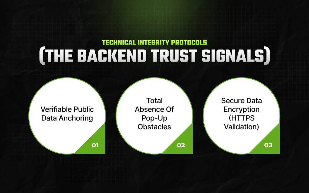
You can write the most persuasive text in the world, but if your backend infrastructure triggers security warnings or fails basic operational compliance checks, search platforms will actively block your traffic.
When discussing financial strategies, wealth metrics, or investment outcomes, you must anchor your assertions in documented reality. Do not just make a generic claim that “bonds are safe.”
Instead, write out the explicit context: “According to historical default data from major credit rating registries, high-grade municipal bonds have maintained an average default rate of less than one percent over the last several decades.”
Link directly to a primary, trusted public economic database. This proves to search bots that your content is safe and rigorously verified.
Intrusive overlays that block the user’s screen the split second they arrive are highly disruptive. Search engines penalize sites that use aggressive mobile pop-ups because they ruin user accessibility.
Keep your presentation clean and let the page content do the selling without relying on annoying digital traps.
If your landing page handles user information, even just a basic email address, without a secure, encrypted connection, modern web browsers will display a giant red warning that screams “Your connection is not private.”
This warning kills your credibility instantly. Ensure your security certificates are active and up to date before launching any marketing campaign.
Transforming a failing page into a high-converting asset does not require complex design degrees or expensive software tools. It requires a relentless focus on reducing user friction and building authentic, verified structural trust.
By auditing your layouts against these core pillars, you transform your website from a silent digital brochure into an authoritative, high-performing conversion machine that both search systems and human readers love to support.
Take a hard, honest look at your current marketing pages today. Are you overwhelming your readers with technical jargon or burying your primary buttons under dense paragraphs of text? Shift to creating engaging landing pages
Run a mobile speed test, eliminate any confusing links, and clearly state your core value within the first three seconds. By prioritizing clarity over cleverness, you ensure your digital storefront stands out as an elite, high-performing asset in a crowded digital marketplace.
Read Also:
Barsha is a seasoned digital marketing writer with a focus on SEO, content marketing, and conversion-driven copy. With 8+ years of experience in crafting high-performing content for startups, agencies, and established brands, Barsha brings strategic insight and storytelling together to drive online growth. When not writing, Barsha spends time obsessing over conspiracy theories, the latest Google algorithm changes, and content trends.
View all Posts

Vector Search SEO: What It Means For Search A...
Aug 21, 2026
AI Image Editing Is Becoming A Practical Part...
Aug 21, 2026
From CCTV To AI: How AI Video Analytics Is Be...
Aug 20, 2026
Cornerstone Content: What It Is, How It Works...
Aug 20, 2026
How AI Tools Are Changing The Way Marketers A...
Aug 18, 2026